Supply chain security
Ten thousand findings a month, and only a handful actually matter.
Product Security
Website Design
Role
Product Designer
Timeline
4 weeks
team
Individual Contributor
platform
Web

The Real Problem
The product operates in a complex space: software supply chain security and deals with vulnerabilities, software components, compliance, risk and security workflows that make sense to technical teams, but can quickly become overwhelming when presented on a marketing website.
The challenge was not simply making the website look more polished.
It was making the value of the product understandable.
The website needed to communicate with several audiences, from security and engineering teams to compliance stakeholders and business decision-makers, without becoming overly technical or reducing the product to generic cybersecurity messaging.
The existing content contained the right information, but the experience needed stronger hierarchy, clearer storytelling and a visual language that could make a technically sophisticated company feel approachable and credible.
The core design question became:
How do you communicate a complex security product quickly enough for someone to understand why it matters, while still giving technical buyers enough depth to trust it?

Finding the Fix
I started by looking at the website as a communication journey rather than a collection of individual pages.
A few problems became clear.
Too much information competed for attention.
Technical terminology, product capabilities and supporting information often carried similar visual weight, making it difficult to know what to read first.
The product value needed to appear before the product detail.
Visitors needed to understand the problem Bulwark solves before being introduced to individual capabilities.
The visual language needed more authority.
For a cybersecurity company, the site had to feel technically capable and trustworthy without falling into the predictable dark interfaces, glowing grids and generic security imagery common across the industry.
Based on that, I focused the redesign around three principles.
A clearer narrative.
Pages were structured to progressively move from the customer problem to the solution, product capabilities, supporting evidence and finally the next action.
Stronger visual hierarchy.
Typography, spacing, imagery, content width and section pacing were used to make long technical pages easier to scan.
A reusable visual system.
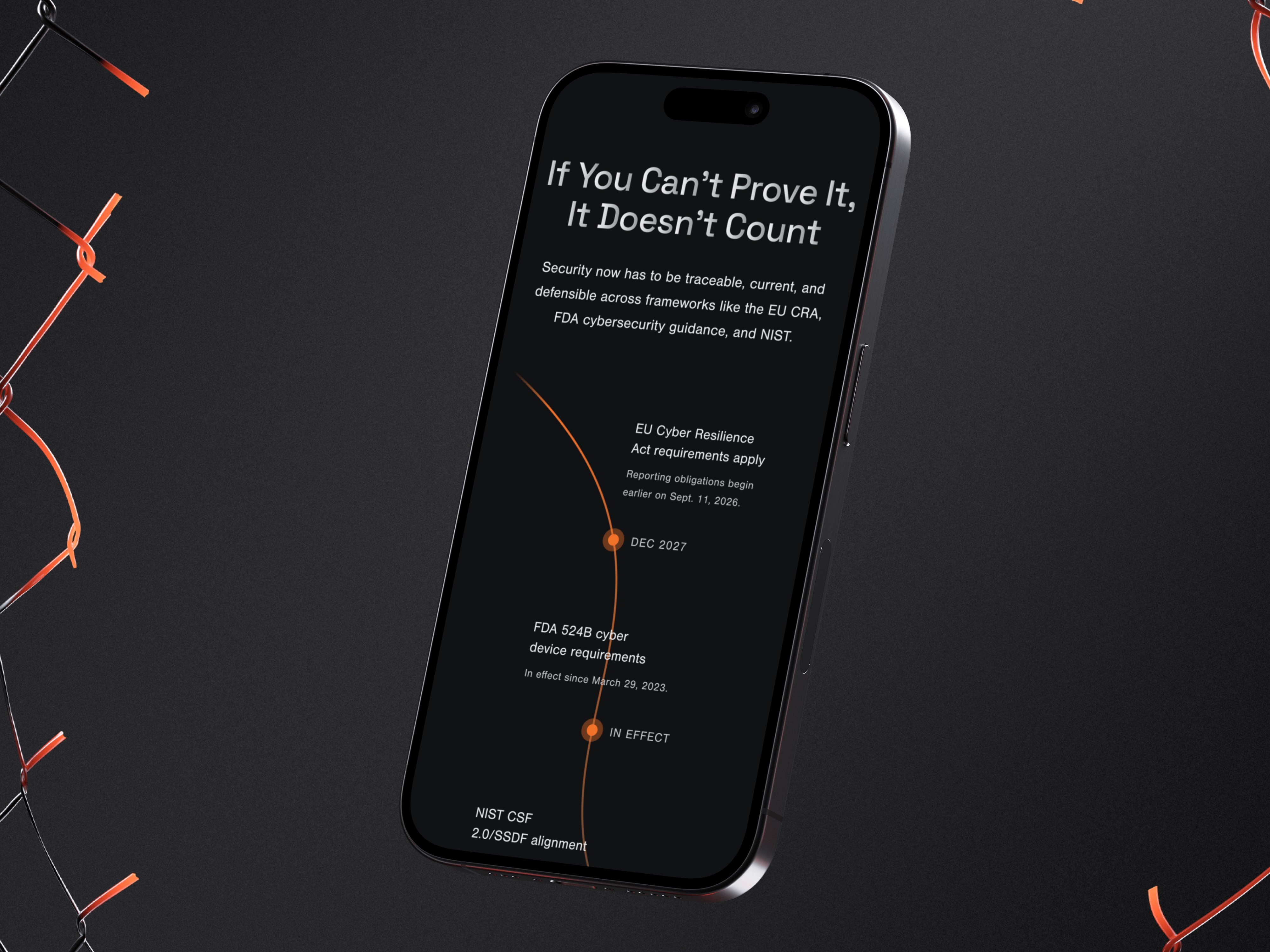
Rather than designing every section independently, I created repeatable patterns for feature communication, product visuals, statistics, supporting content, calls to action and navigation.
The goal was for the website to feel simpler than the technology behind it.
What Actually Happened
The early direction tried to communicate too much too quickly.
Large amounts of product information appeared near the top of pages because everything felt important. While technically complete, the result lacked a strong reading order.
I started reducing rather than adding.
The hero sections became more focused, with one primary message, supporting context and a clear action instead of trying to explain the entire platform immediately.
Product information was then broken into smaller visual stories.
Rather than relying on long sections of copy, I used a combination of concise messaging, interface visuals, feature blocks and supporting content to help visitors understand the offering progressively.
I also paid particular attention to pacing.
Dense sections were followed by more visual sections. Large statements created moments of emphasis. Supporting information was intentionally given less visual weight so that users could scan the page before choosing where to go deeper.
Navigation was simplified around the questions prospective customers were most likely to have:
What does the company solve?
How does the product work?
Who is it for?
Why should I trust it?
What should I do next?
The visual design evolved alongside the UX.

What Changed
The redesigned website created a much clearer way to understand product and its offering.
The experience introduced:
A stronger hierarchy between positioning, capabilities and supporting detail
Clearer storytelling across long, technical pages
More focused hero sections with stronger messaging and calls to action
Product visuals integrated into the narrative rather than presented as isolated screenshots
Reusable UI patterns across feature, content and conversion sections
A more consistent typography, spacing and layout system
Responsive layouts designed to preserve hierarchy across desktop, tablet and mobile
A visual direction that feels technical and credible without relying on cybersecurity clichés
The website became less about presenting everything the product can do and more about helping visitors understand why those capabilities matter.
What I Had to Work With
This was a live enterprise website with paying customers, so nothing could be redesigned in isolation. My job was to translate that complexity into a website experience that could communicate the product quickly and clearly.
I was working with:
Existing brand foundations and visual direction
Technical product messaging around software supply chain security
Product features and platform screenshots
Content aimed at both technical and business audiences
Multiple website pages with different levels of information density
The need to establish trust within a highly competitive cybersecurity market
The biggest challenge was that much of the available content was written from a product and engineering perspective.
That meant I had to think beyond simply styling the supplied content. I needed to reorganize information, define clearer page hierarchy and decide what visitors should understand first, what could be introduced later and which information needed stronger visual emphasis.
I used the existing product interface as a visual reference point, but the website needed its own design language rather than simply looking like an extension of the application.
What I'd Do Differently
With more time, I would push the website further through real visitor behaviour rather than relying primarily on content and design judgement.
I would test different value propositions in the hero area to understand which language resonates most strongly with technical and non-technical audiences.
I would also explore:
More interactive product demonstrations instead of static UI imagery
Role-specific entry points for security, engineering and compliance visitors
Stronger customer proof positioned closer to major decision points
More contextual micro-interactions around technical concepts
Behaviour analytics to identify where users stop scrolling or leave high-intent pages
A/B testing of major calls to action and conversion paths
The foundation is flexible enough for those layers to be added without redesigning the entire system.
What I Learned
Complex products need simple websites.
The more sophisticated the technology, the more disciplined the communication needs to be. The website does not need to explain everything immediately. It needs to give visitors enough understanding to want the next layer.
Visual hierarchy is part of the messaging.
Typography, spacing and composition determine what gets understood before someone reads every word. On technical websites, that can matter as much as the copy itself.
Product screenshots need context.
Showing an interface is not the same as explaining a product. UI visuals become useful when the surrounding story tells visitors what they are seeing and why it matters.
Credibility comes from restraint.
For Bulwark, the strongest visual direction was not the loudest one. Clear typography, thoughtful layouts, strong product presentation and consistent interaction patterns created more confidence than adding unnecessary effects.
Ultimately, my role was to turn a technically complex offering into a website that feels clear, credible and easy to navigate, while creating a visual system capable of supporting the company as its content and product continue to evolve.