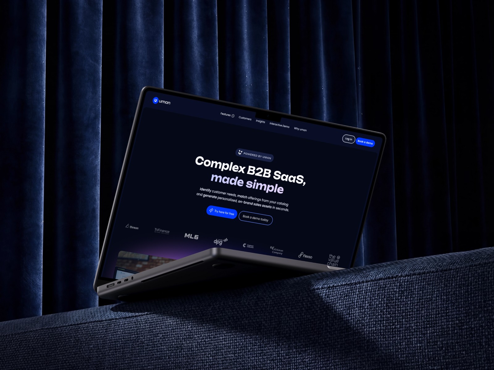
AI sales platform website
A sales platform that does everything, and a website that could not say what it did.
Sales Intelligence
Website Design
Role
Website Designer
Timeline
3 weeks
team
Individual Contributor
platform
Web

The Real Problem
Uman is an AI platform for complex B2B and enterprise sales teams. It pulls CRM data, customer conversations, product and service knowledge, and outside business signals into one contextual sales intelligence layer, and it supports the whole cycle: prospect discovery, personalised outreach, meeting preparation, deal intelligence, account management and cross sell.
That breadth was the website's problem. A product that touches every stage of a sale reads as a feature list the moment you try to describe it. Enterprise buyers, sales leaders, account managers, reps, BDRs and SDRs all landed on the same pages and wanted different answers. And in a market crowded with fragmented sales tools and generic AI products, "AI for sales" on its own said nothing.
The platform had a clear point of view. The website did not.

Finding the Fix
I stopped looking at features and looked at how uman actually creates value across a sale. The story was simpler than the product: connect your data, understand your context, generate sales intelligence, take action. Every page could hang off that spine.
From there I focused on five things:
Product storytelling. Pages organised around real sales problems and outcomes rather than a catalogue of capabilities.
Clear information architecture. Distinct paths for enterprise buyers, sales leaders, account managers, reps, BDRs and SDRs, without breaking the one product story.
A modular design system. Reusable components and layouts that scale across product pages, role pages, industry pages, customer stories and resources.
Visualising AI. Real product interfaces, data relationships and contextual information made the intelligence tangible. No glowing brains, no generic AI imagery.
Conversion focused UX. Demonstrations, proof points, customer stories and calls to action placed where a visitor moves from understanding to exploring.

What Actually Happened
The homepage carried the most weight, so it went first. I built it as a narrative: a hero that states the value in one line, two layout blocks that show the data to intelligence to action flow with the actual product, a call to action, a testimonial band, an FAQ and a footer that opens onto the rest of the site. The order matters. Each section answers the question the previous one raises.
The visual language came next. I settled on a tight palette of Electric Blue (#0037FF), a soft Purple (#D17CFF), White and a Deep Black (#141414). The blue carries the AI feel; the black and white keep it credible for an enterprise buyer who is comparing this against a procurement checklist. Large blurred gradients sit behind the product screens so the interfaces read as the hero, not as decoration.
Then the system. Role pages, industry pages, enterprise pages and resources all reuse the same section components with different content, which meant new pages could be added without a new design each time. Mobile layouts were designed alongside, not after.

What Changed
The redesigned website gave uman:
A single product narrative that explains a platform spanning the whole sales cycle in one scroll
Clear entry points for each buyer and user role
A visual identity that says AI without losing enterprise credibility
A component system that scales to product, role, industry, enterprise and resource pages
Conversion paths built into the story rather than bolted onto the end
The website stopped describing everything uman can do and started explaining why it matters, in the order a buyer needs to hear it.

What I Had to Work With
This was a live product with a long feature list and six audiences, so nothing on the website could be designed for one reader alone.
The constraints shaped most of the decisions:
A product that spans the entire sales cycle, so nothing could be left out and nothing could dominate
Six distinct audiences on one website, with no separate sites and no role switcher
An enterprise buyer who needs proof and a sales rep who needs speed, on the same page
A category full of point tools and AI wrappers, so differentiation had to come from clarity, not claims
A page system that had to keep growing after handover
I designed the site and the system; the traffic and conversion numbers belong to the uman team who run it.

What I'd Do Differently
I would test the homepage narrative with two or three actual sales leaders before building the rest of the system. The flow is logical, and I would like to know sooner whether it is how they think.
I would also push further on:
Interactive product demonstrations inside the site rather than static screens
Role specific proof, so an SDR sees SDR outcomes and a CRO sees pipeline outcomes
A lighter path from a resource page back into the product story
What I Learned
Breadth is not a message. When a product does many things, the website's job is to pick the order.
Show the product. Real interfaces did more to make the AI believable than any illustration could.
A system is the deliverable. The homepage launches once. The components get used every week after that.